STATS
Overview
Stats provides comprehensive analytics and performance metrics for your store. View historical data with interactive graphs showing records, API requests, and search response times. Use date-range filtering to analyze trends and optimize performance through Configuration settings.
Why Use Stats?
Stats help you:
- Analyze trends - Understand usage patterns over time
- Monitor performance - Track response times and identify bottlenecks
- Plan capacity - Forecast based on historical data
- Identify issues - Spot anomalies and performance degradation
- Optimize resources - Make data-driven decisions
Real-World Example: Notice a spike in search requests but declining response times? Stats graphs help you identify when performance degraded and correlate it with increased load. Use API Logs for detailed investigation and Configuration for optimization.
Date Range Selector
Quick Access Options
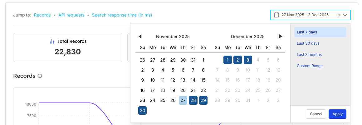
Quick Options:
- Last 7 days (default)
- Last 30 days
- Last 3 months
- Custom Range
Key Metrics Cards
Three summary cards display high-level statistics:
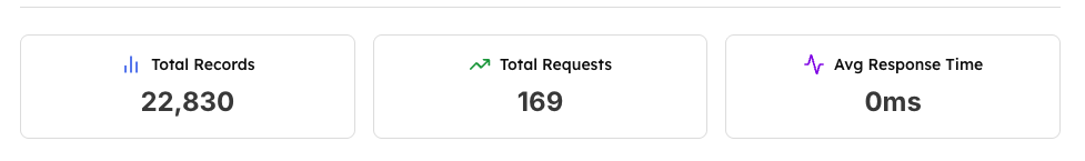
| 1. Total Records | 2. Total Requests | 3. Avg Response Time |
|---|---|---|
Meaning: Total number of records/documents in your index Use:
| Meaning: Total API requests made during selected period Use:
| Meaning: Average API response time in milliseconds Use:
|
Records Graph
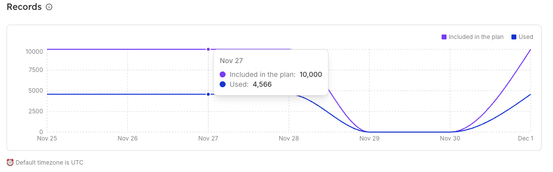
Title: Records
Purpose: Visualize index record changes over time
| Y-Axis | X-Axis | Legend |
|---|---|---|
Record count (0 to 10000+ scale) | Dates (Nov 25 - Dec 1) | Purple line: Plan limit Blue line: Actual records |
Understanding the Records Graph
| What to Monitor | Purple Line (Included) | Blue Line (Used) |
|---|---|---|
|
|
|
API Requests Graph
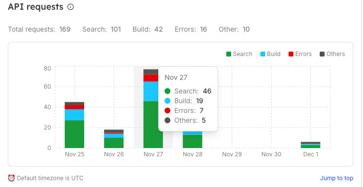
| Overview | Graph Elements |
|---|---|
Title: API requests Purpose: Breakdown of API request types over time Display: Interactive bar chart with color-coded segments showing API request distribution across different categories and time periods for comprehensive analysis | Y-Axis: Request count (0 to 220+ scale) X-Axis: Dates (Nov 25 - Dec 1) Legend: Green: Search requests Blue: Build requests Red: Errors Gray: Others |
Understanding the API Requests Graph
| What to Monitor | Color Segments |
|---|---|
| Green (Search): User search activity and queries Blue (Build): Index updates and data imports Red (Errors): Failed requests that need attention Gray (Other): Admin operations |
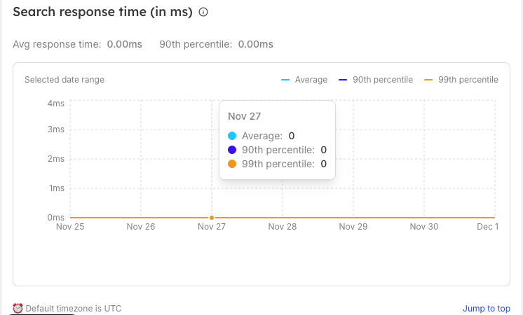
Search Response Time Graph
| Overview | Performance Metrics |
|---|---|
Title: Search response time (in ms) Purpose: Monitor search performance over time Display: Interactive line graph with multiple percentile markers showing real-time performance trends and statistical distribution of response times across different time periods | Average response time:
90th percentile:
Note: Values at 0ms may indicate:
|
| Graph Elements | Legend |
|---|---|
Y-Axis: Response time in milliseconds (0ms to 4ms scale) X-Axis: Dates (Nov 25 - Dec 1) | Blue line (Average): Mean response time Purple line (90th percentile): 90% of requests faster than this Yellow line (99th percentile): 99% of requests faster than this |
Understanding the Response Time Graph
| Three Performance Lines | Performance Benchmarks | What to Monitor |
|---|---|---|
Blue (Average): Mean response time across all requests Purple (90th percentile): 90% of requests are faster than this Yellow (99th percentile): 99% of requests are faster than this |
|
|
Default Timezone Note

| Display | Meaning | Jump to top |
|---|---|---|
Default timezone is |
| Link to scroll back to page top |
Working with Stats
Analyzing Trends
| Week-over-Week | Identify Patterns |
|---|---|
|
|
Performance Optimization
| Step 1: Check response time graph | Step 2: Correlate with requests | Step 3: Review records | Step 4: Take action |
|---|---|---|---|
|
|
|
|
Capacity Planning
| Monitor Record Usage | API Request Trends | Performance Benchmarks |
|---|---|---|
|
|
|
Important Notes
| Data Accuracy | Timezone Consideration | Graph Interactions | Performance Context |
|---|---|---|---|
|
|
|
|
Setting Alerts
Recommended Thresholds:
| Records | Response Time | Error Rate |
|---|---|---|
|
|
|
Using Data for Decisions
| Scaling Decisions | Index Optimization |
|---|---|
|
|
Frequently Asked Questions
Why are my response times showing 0ms?
This can occur when:
- Store is newly created with limited data
- Very low traffic during selected period
- Performance logging is still initializing
- Select a longer date range for meaningful data
How far back can I view historical data?
This depends on your plan and data retention policy. Typically:
- Standard plans: 30-90 days
- Enterprise plans: 1 year or more
- Contact support for specific retention details
What causes spikes in the API requests graph?
Common causes:
- Scheduled index rebuilds
- Bulk data imports
- Marketing campaigns driving traffic
- Automated testing or monitoring
- System migrations
Why did my record count drop suddenly?
Possible reasons:
- Index rebuild or refresh (configured in Configuration)
- Data cleanup or deletion
- Migration to new schema
- Temporary system maintenance
- Check API Logs for corresponding events
How do I improve response times?
Optimization strategies:
- Review and optimize query patterns in Configuration
- Reduce index size if over-provisioned
- Optimize searchable attributes in Configuration
Can I compare different time periods?
While the UI shows one range at a time, you can:
-
Take screenshots of different periods
-
Use multiple browser tabs for side-by-side viewing
Why do graphs look different from API Logs?
- Real-time, live view
- Shows individual requests
- Recent activity focus
Stats:
- Historical, aggregated data
- Shows trends and patterns
- Long-term analysis focus
Related Features
- API Logs: Real-time API request monitoring and debugging
- Configuration: Store settings and performance optimization
- Browse: View and manage indexed data
- Analytics Overview: Comprehensive search behavior analytics
- Store Management: Multi-store operations and capacity planning
- Billing: Plan features and scaling options